Posted by: woberto [x] - (210.23.153.---)
Date: March 26, 2024 09:11PM
I have no login issues using firefox.
Occasionally (cannot replicate) if I log in on a full screen image, then go to the gallery, it logs me out.
Posted by: pro_junior [x] - (Moderator)
Date: March 27, 2024 12:26AM
When I log out I have to log in again. Every time.
Posted by: woberto [x] - (210.23.153.---)
Date: March 27, 2024 02:27AM
Sixty percent of the time, it works every time.
Posted by: pulse [x] - (Moderator)
Date: March 27, 2024 06:13AM
pro_junior Wrote:
-------------------------------------------------------
> When I log out I have to log in again. Every time.

Try deleting cookies, or uninstall your browser?

Don't worry about reinstalling. Everything will be aaaallllright.
Posted by: Anon [x] - (59.100.232.---)
Date: April 04, 2024 03:18AM
Widen the text box on a computer screen (I haven't seen in on a phone) and narrow the gaps between posts, just a little. I think that would make things a bit faster. Otherwise it's good.
Posted by: pulse [x] - (Moderator)
Date: April 11, 2024 02:02PM
Speed of rendering isn't based on how many pixels, it's just a box definition. Now; 3 extra pixels between each box means the entire page will take you 1/50 of a swipe more but.. meh.

On image pages, the text box matches the displayed image with, with space for the content boxes down the left hand side. Not much I can do to expand them without expanding the entire page. Which I haven't looked into because for the most part I'm not unhappy with the width.
Posted by: pulse [x] - (Moderator)
Date: June 28, 2024 01:27PM
I got bored again.


...watermark annoyed me. And to be honest I've been thinking about doing something with the watermark for .. literally years.

I've redone the watermark code today to

a) add a bar to the bottom of the image
b) choose randomly if the watermark will go left or right
c) pick the bottom pixel above where the site logo will go
d) colour the bar it added based on that colour
e) watermark it!

I've uploaded a sample of images to demonstrate what it's going to do. Ignore the car one (below) because it placed the watermark half over the image and half over the bar; which admittedly is still better than the above picture.


Thoughts?

It's a real shame that I don't have any of the original images anywhere that I could re-apply the watermark code to them, because at the moment I really prefer this. It doesn't fuck up the image if it gets it wrong smiling smiley

Edit: Oh yeah, my original idea was to use a histogram of the image and choose the "average" colour in use in the picture, and make the bar that colour. But even though I liked the idea I think I prefer the effect of choosing the closest pixel to where the watermark will go and making it match that. On the whole I think it'll look less intrusive (which was my main concern with adding a bar instead of inserting the watermark within the image boundaries like it's been for 20 years).


Edited 1 time(s). Last edit at 28/06/2024 01:31PM by pulse.
Posted by: pro_junior [x] - (Moderator)
Date: June 28, 2024 03:38PM
you fixed the watermark code so that it doesn't cover part of the image???????eye popping smileyeye popping smileyeye popping smileyeye popping smileyeye popping smiley
BRAVO!!

Posted by: woberto [x] - (254.249.57.---)
Date: June 29, 2024 02:30AM
Hysterectomy-gram?
Posted by: pulse [x] - (Moderator)
Date: July 01, 2024 01:07AM
pro_junior Wrote:
-------------------------------------------------------
> you fixed the watermark code so that it doesn't
> cover part of the image???????eye popping smileyeye popping smileyeye popping smileyeye popping smileyeye popping smiley
> BRAVO!!

I love that image smiling smiley
Posted by: pro_junior [x] - (Moderator)
Date: July 01, 2024 06:59AM
MS paint FTW (banana)
Posted by: pulse [x] - (Moderator)
Date: July 01, 2024 07:08AM
It's amazing, the tools that a professional graphic designer like yourself can use and still get an amazing outcome.
Posted by: pro_junior [x] - (Moderator)
Date: July 02, 2024 06:16PM
Watermark issue handled thumbs upthumbs up

Next challenge: on mobile show who pic uploader is... (*monty*)
Posted by: pulse [x] - (Moderator)
Date: July 02, 2024 11:22PM
You know, that's annoyed me for a while too. And I think it's potentially as little as 1 line of code. Should be a piece of piss. If I'm right I'll do it today.

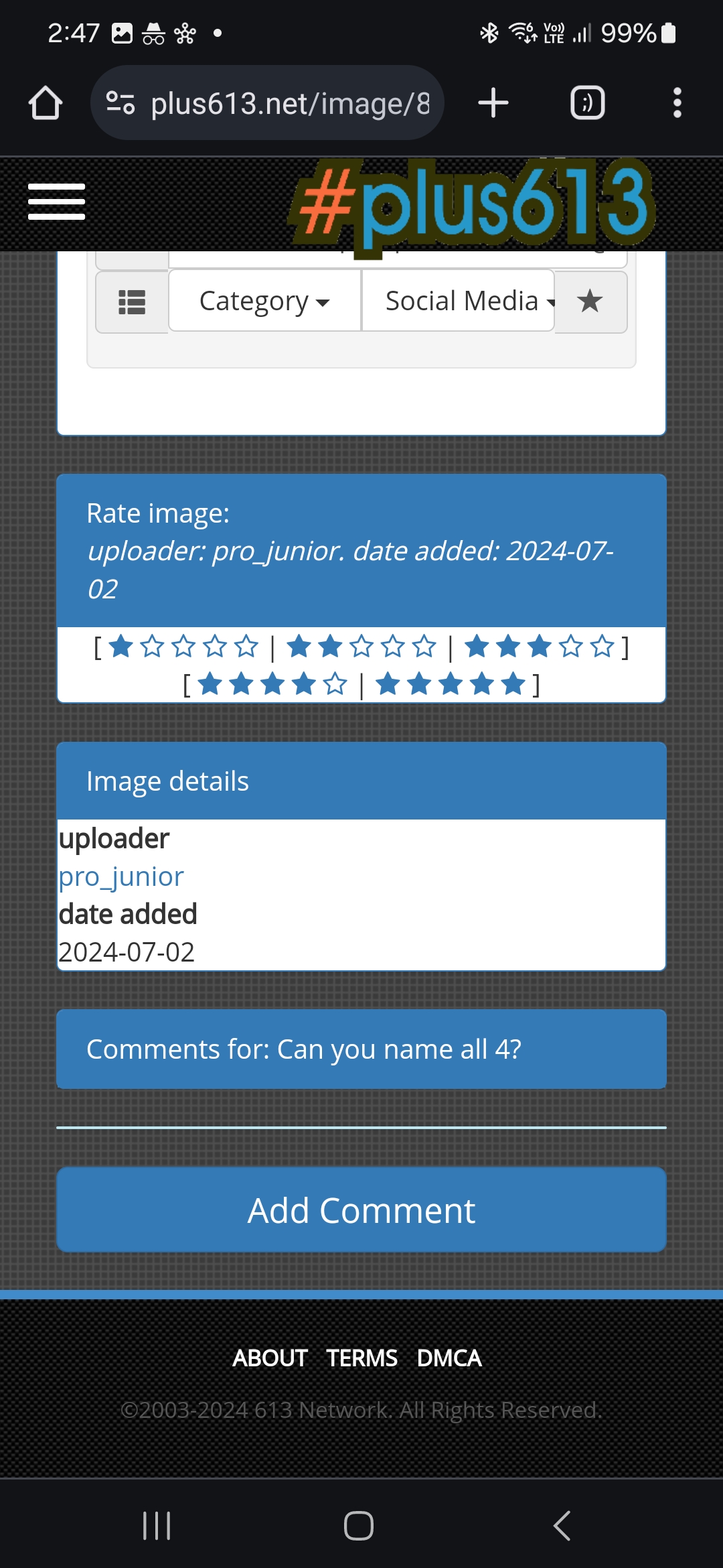
I recently added the "stars" rating box for mobile too because you couldn't actually score an image. I think the vote count has jumped dramatically. That's where o think it will make most sense to add uploader name.

I use the site probably 90% on desktop so small things like that often slip my mind.

Any other suggestions? Keep them fairly small smiling smiley


Edited 1 time(s). Last edit at 02/07/2024 11:24PM by pulse.
Posted by: pulse [x] - (Moderator)
Date: July 03, 2024 04:51AM
Okay I had a quick play while being bored senseless by a meeting.

There's 2 options I came up with in the attached image; not sure if it should have its own box, or if it should just be details inside the "rating" box.

Both of them TBH look kind of shit on desktop, so not entirely sure how to block it on desktop site. Anyway; thoughts?

Posted by: woberto [x] - (247.123.39.---)
Date: July 03, 2024 08:12AM
On my Nokia (yes I still buy Nokia) the plus613 banner covers the few items at the top, obscuring the text of the "image title".
I am too lazy to screenshot it, it's in the car and it's cold. Maybe tomorrow.
Posted by: pulse [x] - (Moderator)
Date: July 03, 2024 08:41AM
Really? Wonder if it's a screen resolution issue. No idea what we designed it for.
Posted by: pro_junior [x] - (Moderator)
Date: July 03, 2024 03:34PM
I think inside the ratings box is better than the separate box.. the separate box is kinda clunky
Posted by: pulse [x] - (Moderator)
Date: July 04, 2024 08:59AM
The main thing I didn't like about "inside the ratings box" is the way I've done it at the moment makes the blue title bar too fat.

Maybe I can add the text below the "stars", wonder what that would look like.

At the moment the site is served by some hardware still in the US and some hardware in Australia; at the moment it's all being served out of Australia because I'm rebuilding the US equipment to match the same stuff as local. I've got way too fancy with the network on this for a little website.

Once I've finished that I'll get back to playing with the text box thingo.
Posted by: pulse [x] - (Moderator)
Date: July 06, 2024 07:10AM
OK I've made the change to the voting box. I don't mind it; what do others think?

It still displays on both desktop and mobile versions of the site; that whole box probably doesn't need to display on desktop site.. but problem for another day.
Posted by: pulse [x] - (Moderator)
Date: July 08, 2024 12:07PM
Sigh. I've broken the fucking smileys.
Posted by: pulse [x] - (Moderator)
Date: July 08, 2024 12:58PM
I've un-fucked the smileys. That is all.

While I was messing around though, I've made the "pop up" smiley box (eg when you click on the smiley icon) 250 pixels wide (up from 150 it was). If it breaks something let me know
Posted by: woberto [x] - (240.165.199.---)
Date: July 09, 2024 09:16PM
(*horse*)
Posted by: pulse [x] - (Moderator)
Date: July 14, 2024 02:25PM
Can't believe PJ never commented on the updated image ratings box. What a jerk

@woberto what does that look like on your old man phone?
Posted by: pro_junior [x] - (Moderator)
Date: July 14, 2024 07:33PM

I'm sorry.
I will try to do better at acknowledging your 1337 h4x0r c0d3z
Posted by: pro_junior [x] - (Moderator)
Date: July 14, 2024 08:00PM
holy cow...
when you go to a user's homepage and look at the box showing their 'recent images' there is now a button you can click to show (more...) so it's much easier now to see more than their last 8 uploads (banana)

did you fix this on purpose or... spinning smiley sticking its tongue out
Posted by: pulse [x] - (Moderator)
Date: July 15, 2024 12:09AM
Oh yeah I did that last week. The same thing annoyed me

Edit: didn't realise anybody looked at that but me smiling smiley also the shout box I fixed a month or two ago. Not for any reason.


Edited 1 time(s). Last edit at 15/07/2024 12:10AM by pulse.
Posted by: woberto [x] - (241.98.26.---)
Date: July 15, 2024 11:49AM
The AI tags are numerous now.
I have to scroll down a quarter mile,
just to get to the comments.
(On my old man mobile thst is)
Posted by: pulse [x] - (Moderator)
Date: July 15, 2024 01:44PM
Sometimes the script goes nuts and adds the same 3 tags to an image multiple times; but shouldn't ever have happened THAT many times?

I more meant the "image rating" box on your old man phone.

Got an example image of scrolling miles because of tags?
Posted by: pulse [x] - (Moderator)
Date: July 15, 2024 01:48PM


So eg this is what I'm talking about; does it fuck up the formatting on old man mode?
Your Name: 
Subject: 
Message: