woberto
Report This Comment
Date: March 27, 2013 11:19AM
The leading is incorrect. Frank could explain it, been too long for me.
j1mg
Report This Comment
Date: March 27, 2013 11:35AM
It's all on one line, there is no Leading, do you mean Kerning?
pulse
Report This Comment
Date: March 27, 2013 12:00PM
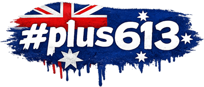
I wanted a higher res version because the one up top was the only copy we had
(originals lost years ago). Created a vectorized version but I'm a bit unsure
about the p and the 6. Mostly pretty happy with it though.
BlahX3
Report This Comment
Date: March 27, 2013 02:41PM
The u is screwy too and the 3 is disconnected from the rest.
GAK67
Report This Comment
Date: March 27, 2013 06:18PM
The holes inside the p and the 6 aren't round.
pulse
Report This Comment
Date: March 27, 2013 09:00PM
The 3 is disconnected in the original one too (though I think I never liked
that). I can tell the hole in the 6 isn't round but I always thought the p was.
Interesting.
If you zoom right in on the original you'll see the line in the u isn't uniform,
it comes down into a spike (not sure how to describe it), it's just not very
pronounced since its so small and low quality.
I'm pretty happy with how this one came out I think
woberto
Report This Comment
Date: March 28, 2013 02:48AM
Kerning, that sounds more like it.
Computers are great.
pulse
Report This Comment
Date: March 28, 2013 09:21AM
The only higher res version it had was this one

It was never used higher res I don't think.. the native version was probably the
one used for the logo rather than a big one resized. Interesting site though
fossil_digger
Report This Comment
Date: March 28, 2013 09:50PM
#℘ḽυṧ613
316snld#
#קℓµร613
#Þ∟џS613
#ρℓυร613
#ρℓષઽ613
#pŁus613
#РŁỮŞ613
#ƤŁƱƨ613
#pℓนร613
#рℓΰટ613
fossil_digger
Report This Comment
Date: March 28, 2013 09:51PM
☠
fossil_digger
Report This Comment
Date: March 28, 2013 09:52PM
#ρḽυṥ613
DarkKlown
Report This Comment
Date: April 03, 2013 01:40PM
I'm with you fossil.. Always thought the logo would look good with ascii
'markup'
fossil_digger
Report This Comment
Date: April 03, 2013 03:10PM
it's too damn plain like it has been. drip some blood off of it or give it a
flame job....or something equally bad ass.

pulse
Report This Comment
Date: October 21, 2013 09:28AM
I did a few new logos ages ago, DK shot me down because of the
"brand".